Asian Paints: Fluid Design System

Building a Scalable
Design System
for
an International Brand

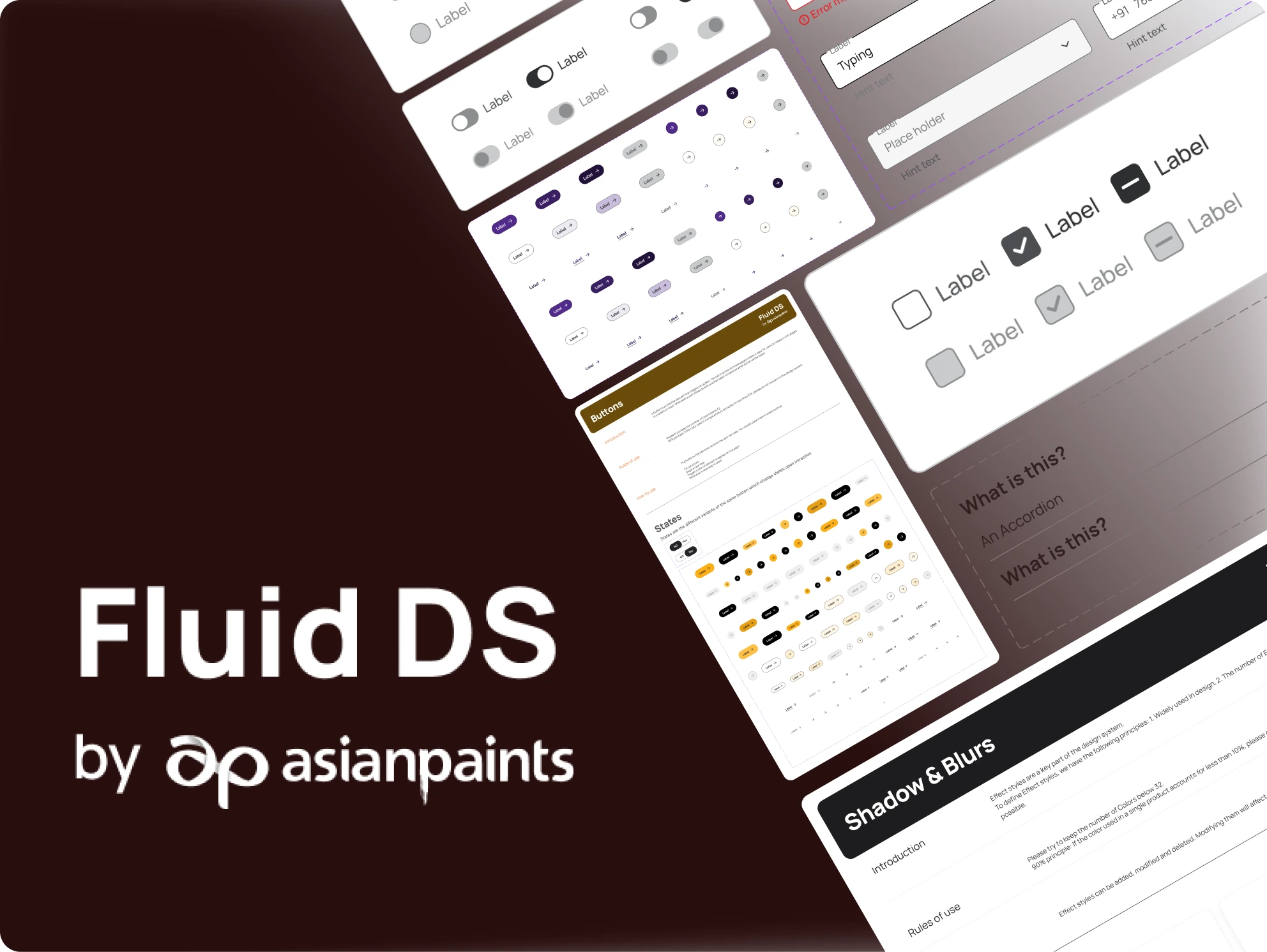
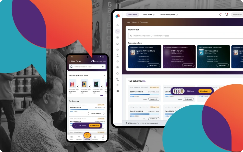
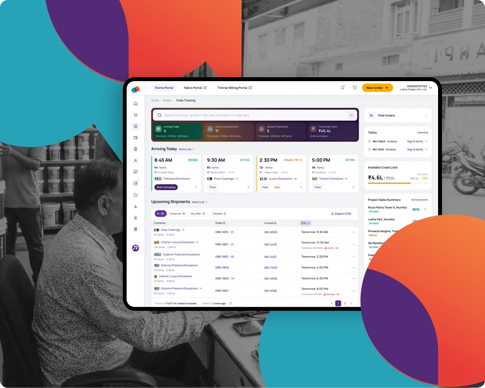
Robust design system for brand websites, end user and in-store Android/iOS apps across SAARC & Middle East for a market leading Indian paint manufacturer.
Problem

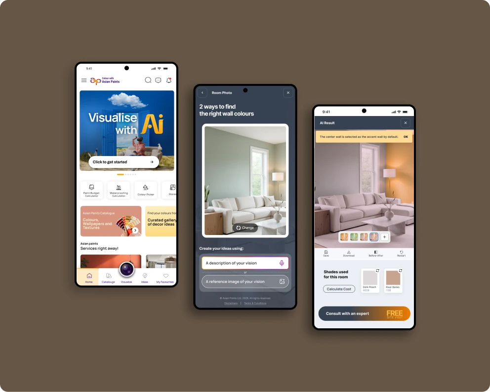
Asian Paints though having a strong brand language across their physical product range, lacks a consistent visual pattern in their online and “phygital” experience platform. With the company making a major shift from being just a paints brand to a complete home decor solution provider, from kitchen & bath appliances, fixtures, furnishings, lights and many more under their ‘Beautiful Homes’ umbrella, it becomes essential that a solid brand identity be present across the multiple sub brands.

More importantly, a design system will speed up and standardise implementation and maintenance of their growing and vast collection of digital assets: Asian Paints, Beautiful Homes, White Teak websites and apps.

My Role

Lead Product Designer.

  • Curated a comprehensive design system foundation with like color palettes, shadow styles, spacing guidelines, and icon libraries.
  • Developed a robust variable and token system with clear naming conventions and detailed configurations.
  • Conducted thorough component analysis to identify specific component needs across various UX flows.
  • Built adaptable and scalable master components by designing flexible components that could be easily modified to suit project requirements.
  • Provided comprehensive documentation with covering usage best practices, component anatomy, and other essential information.
XX weeks explorations YY weeks design alignment

I partnered with the team throughout the process, had regular check-ins, to iterate quickly and ensure we accounted for all the use cases and ensure the design system had high adaptability. It was a fast moving team & we stayed tightly aligned from design to delivery.

KPIs
>0%
Adoption
of the UI be built using Fluid DS components.
<0%
Efficiency
time spent fixing UI bugs/month
0%
Quality
accessibility a11y (core component compliance)
+0
Sentiment
Internal NPS (Survey of Designers and Developers)
Setting up Foundation

Fundamental Components

Colours

Primary, Neutral, secondary, tertiary and status colour palettes.

Colours are a key part of the design system. To define colours, we have the following principles:

1

Widely used in design.

2

The number of colours should be as small as possible.

The colour in Fluid DS has two parts, the colour in the Themes variable and the colour styles. Their difference is: when switching between light and dark mode, the colour in the Themes variable will change, but the colour in the colour styles will remain unchanged.

Spacing

An 8 point Grid System was adhered to for maintaining consistency and relevancy. Just like our colour scale, working from a defined spacing system allows us to work faster and more consistently. Consistent and scalable spacing helps you eliminate guesswork whilst designing and developing because you're designing with a limited set of options.

Icons

Simple like icons with rounded edges were selected to keep designs minimal and clutter free. We selected two styles: Simple line icons and line icons with a circular boundary, to better suit the usage scenario.

Setting up Variables

Token Library

This was the backbone of our Design System.

The Challenge

Everything at once &
ocean of layers+components

It was a busy floor in the digital section of the Sales and Marketing floor. Imagine this:

1

Nonstop flow of business requirements.

2

UX team is making wireframes and prototypes to get approval on the flows.

3

We need to setup our design system from scratch so that it can be used for hi-fi designs.

4

Regular feedback on the design system in sync with ongoing visual design upgrades.

File size became monstrous and man-hours keep increasing as the design system grows.

Our approach to components were not the most optimal. Thus, the work load kept increasing.

For example, the buttons had 144 instances. It would be hectic to maintain them separately.

The Solution

We used variable properties.

It introduced ease in building these components as well as made implementation simpler and flexible by:

  • Reducing the number of components.
  • Enhancing flexibility to implement changes quickly.
  • Promoting sustainable design practices by reducing the number of hidden layers.
The Implementation

3 step process

Below is a mini example of input component that was made using above mentioned approach.

The Documentation

Topics that were covered.

Documentation covered structure, spacing, properties, usage guidelines, do’s/dont’s & more for every components and foundation topics.

Anatomy

Measurements

States & Types

Tokens

Button Large Primary Default

Closing notes.

01Baseline Sentiment+
Digital products gained a unified visual language across brands and platforms.
02Building foundations to solve inconsistency+
Fluid DS established shared colours, spacing, icons, and tokens as the system’s common foundation.
03Flexible components to solve scale and repetition+
Components were built as adaptable masters to handle variation without multiplying one-off patterns.
04Structured properties to solve complexity+
Variables, nesting, and clear taxonomy reduced duplication, hidden layers, and maintenance effort at scale.
05End impact+
Fluid DS is improving consistency, speeding up design-to-development workflows, and creating a scalable base for long-term coherence.
Next

Let's make it
transcend.

soumyajyotihalder2021@iitkalumni.org